Design Guidelines

The visual elements of the College of Liberal Arts (CLA) are designed to align with the Purdue brand while also showcasing our creative identity. Our typography, color palette, photography, and graphic elements work in synergy to craft a cohesive yet distinct visual language.

Want to start a new project with the marketing team? Click below to get started!

A banner displaying the text The Degas Collection

Fonts

Purdue's typography communicates clearly and cleanly, with enough flexibility in its consistent font selections for a wide range of situations and applications.

Acumin Pro
Best used for headers, sub-headers, and body text.

United Sans
Best used for headers and sub-headers.

Source Serif Pro
Best used for body text.

DOWNLOAD FONTS

Alternative fonts

Purdue's primary typefaces may not always be available depending on the application. When you are unable to use the primary typefaces use the following alternate fonts:

  • Franklin Gothic in place of Acumin Pro
  • Impact in place of United Sans
  • Georgia in place of Source Serif Pro

Always use Purdue fonts (or alternative fonts) for all text.


Colors

Color is one of the most recognizable aspects of Purdue's brand identity. We are Gold and Black, but we also have a supporting color palette to help create stronger compositions.

Primary Colors

#CFB991 Boilermaker Gold

#000000 Black

Supporting Colors

#8E6F3E Aged

#DAAA00 Rush

#DDB945 Field

#EBD99F Dust

#555960 Steel

#6F727B Cool Gray

#9D9795 Railway Gray

#C4BFC0 Steam


Best Practices

  • When creating any visual materials, always leave a margin between the edge of the page and the text.
  • When using the Purdue co-brand, make sure there is enough space around it to fit the motion P.
  • Include only the most important information on materials. For all other information, link to your website for more details.
  • Use United Sans or Acumin Pro for headers and sub-headers and Source Serif pro or Acumin Pro for the body text. This will keep content consistent and clear.
  • Always use Purdue colors and fonts for all text and design elements. This makes all materials easily recognizable as Purdue University.

Readability

Readability is very important to keep in mind when creating a design. It gets your message across quickly and allows the reader to efficiently find the information.

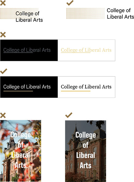
  • Instead of putting text over patterns, try putting the pattern next to text.
  • Putting light text on light backgrounds or dark text on dark backgrounds doesn’t create enough contrast and makes it hard to read. Ensure you are using light text with dark backgrounds and dark text with light backgrounds.
  • When placing text over an image, choose a simple image and make the contrast between the text and image easily readable by turning the image’s brightness down.
  • Rather than have large sections of only text, break it up with an image, a quote, or another type of visual element. This makes it easier on the viewer’s eyes and improves readability, balance composition, and enhances visual clarity. This will increase the chance of viewers reading more or all your content.

Photography

Photography is a powerful asset for visual storytelling. It helps us paint a full, rich picture of Purdue. When used thoughtfully, we can create a feel that is distinctly Liberal Arts.

  • Portraits should feel natural and in the moment. When taking photos, ensure the subject is relaxed by talking with them, keeping the atmosphere lighthearted and eliciting more genuine expressions.
  • Candid photos should capture people in moments of real emotion including smiles, laughter, and other positive expressions, as well as introspection and hopeful reflection. When scouting for these photos, look for studios, labs, common areas, gathering spaces, and other locations that showcase the work CLA is doing.
  • When possible, capture students collaborating with others.
  • If you don’t have a camera, your phone works just as well. Don’t forget to turn it horizontal to get wide shots.
  • Think about lighting when taking photos. Try to shoot outside for natural lighting or in bright, airy spaces.
  • Photos should be high resolution.