About This Site
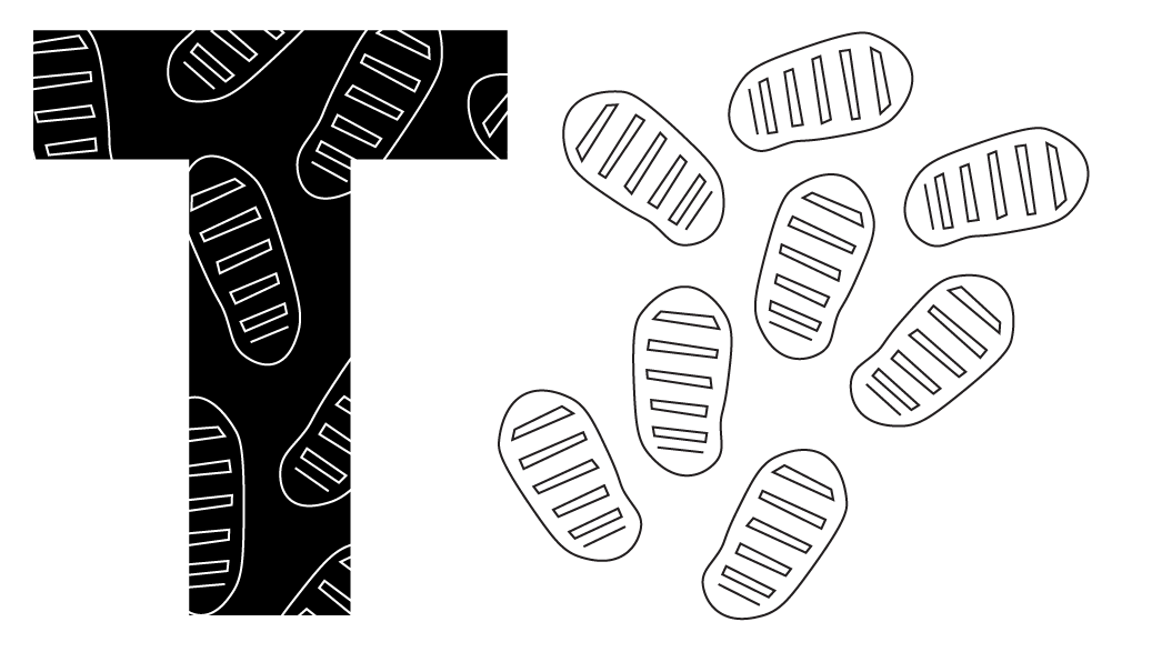
The Only T
This pattern was intended to represent Neil Armstrong's footprints, yet several people saw it as mitochondria. This unintentional interpretation ended up being a happy coincidince, as either reading makes sense within the STS context.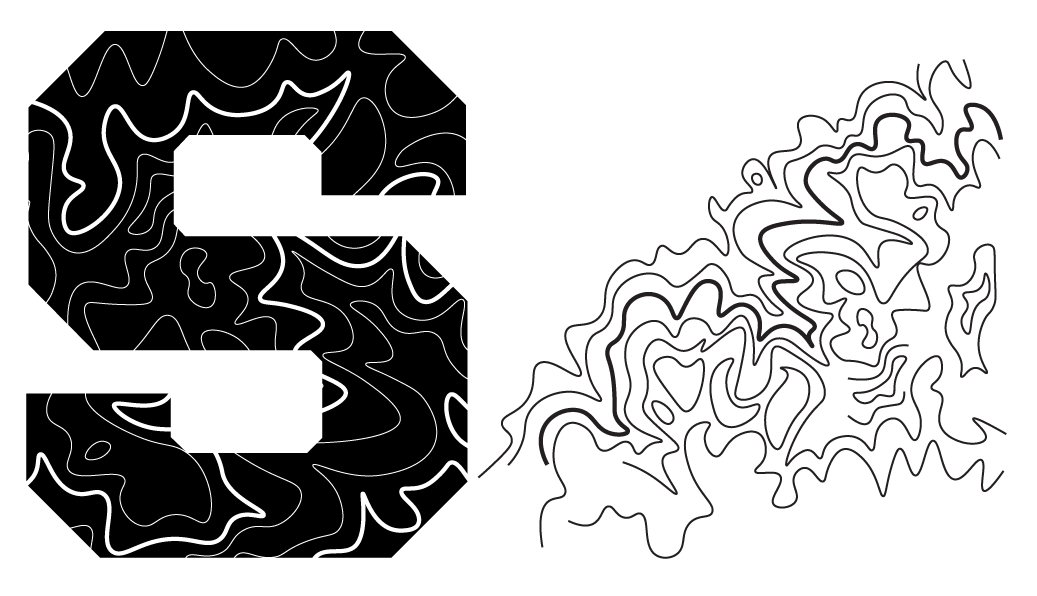
The Second S
This pattern is based on a topographic map of Purdue's campus. Getting it to properly read as topography was a challenge. What ended up working was adding a bold line to make it more similar to a map. The bold also added some visual interest, so I went back to the previous patterns to add some line weight variation.
About The Designer
This site was designed by Seth Newlin, a graduate from Purdue University with a Bachelor's in Visual Communication Design. While working on the STS design package, his primarily goal was to make something that fit well with the established Purdue design conventions yet still had a unique identity. The solution was to use patterns representing different elements of the STS program but contain them within standard Purdue fonts and colors. The end result is a look that is distinctly "Purdue" yet still maintains a distinctive feel.

Seth's Portfolio
Portolio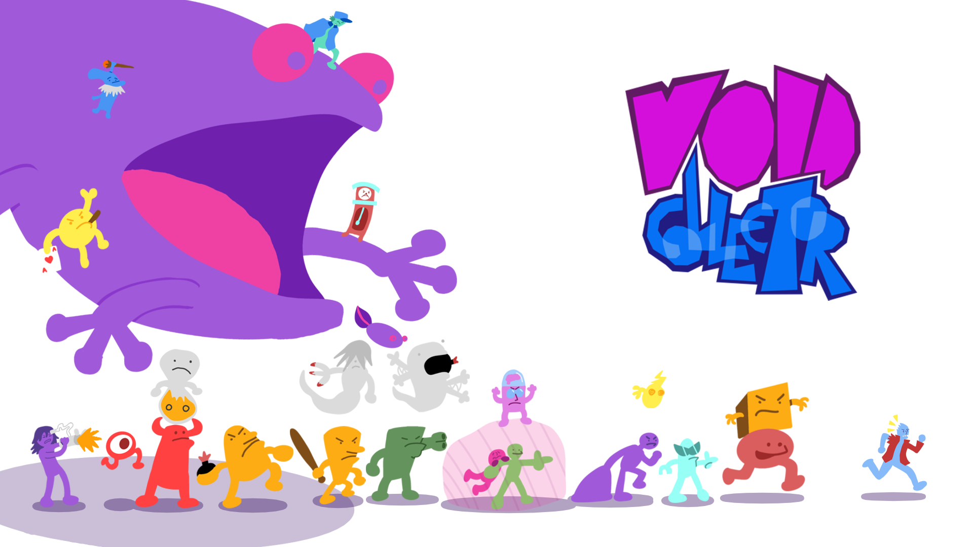
Seth's Game Development
Void Collector